8 Essential Types of Maps: Complete Navigation Guide
Have you ever wondered why there are so many different types of maps out there? From the colorful atlas in your childhood classroom to the GPS on your smartphone, maps serve as our window to understand the world around us. As someone who's been fascinated by cartography since getting hopelessly lost on a hiking trip (more on that embarrassing story later!), I've come to appreciate how each type of map serves a unique purpose in our lives.
Maps are more than just drawings of the earth's surface; they're powerful tools that show us everything from mountain ranges and rivers to political boundaries and economic resources. Whether you're planning a road trip, studying climate patterns, or just trying to understand global politics, there's a specific map designed to help you navigate that particular landscape.
Understanding the Fundamentals of Maps
Before diving into the specific cartographic varieties, let's take a moment to understand what exactly makes a map. At its core, a map is a visual representation of an area—large or small—showing the relationship between elements of that space. Maps help us understand where things are, how to get from one place to another, and the characteristics of different regions.
I remember my geography teacher saying, "A good map answers questions you didn't even know you had." That statement stuck with me through the years, especially when I found myself relying on various maps for different purposes. Maps essentially compress the three-dimensional world into a two-dimensional format that our brains can easily process and understand.
Maps have been around for thousands of years, evolving from crude cave paintings to sophisticated digital interfaces. Yet despite all these technological advances, the basic purpose remains the same: to help us make sense of our world and our place in it. What has changed dramatically is the specialization and variety of maps available to us today.
Physical Maps: Nature's Topography Revealed
When most people think of maps, physical maps are often what first come to mind. These maps showcase the natural landscape features of our planet, highlighting mountains, rivers, lakes, oceans, and other geographical elements. The beauty of physical maps lies in their ability to give us a bird's-eye view of Earth's diverse terrain.
On physical maps, water bodies are typically depicted in blue, while elevation changes are shown through different colors and shading. Lower elevations usually appear in green (think fertile valleys and plains), while higher elevations transition through yellows and browns (representing hills and mountains). This color-coding system makes it incredibly intuitive to understand the landscape at a glance.
I once used a physical map while planning a camping trip in the Rockies, and it saved me from setting up camp in what would have been a flash flood zone during the spring melt. The contour lines and elevation markings helped me find the perfect spot that was both scenic and safe. Physical maps don't just show us what's there—they help us make better decisions about how we interact with the natural world.
These maps are invaluable for hikers, environmentalists, geologists, and anyone who needs to understand the natural features of a region. They provide context for understanding everything from wildlife habitats to natural disaster risks, making them one of the most fundamental map types in existence.
Topographical Maps: Every Detail Matters
Elevation precision is what sets topographical maps apart from their physical counterparts. While they also display natural features, topographical maps use contour lines to show elevation changes with incredible accuracy. Each contour line connects points of equal elevation, allowing users to visualize the three-dimensional landscape on a flat surface.
These maps typically feature large-scale detail, meaning they cover smaller areas but with much greater precision. What makes topographical maps particularly useful is their inclusion of both natural and man-made structures. You'll find everything from small creeks and gentle slopes to buildings, trails, and power lines carefully documented.
I still laugh thinking about my first serious hiking trip, where I brought along a road atlas instead of a proper topographical map. What looked like a "small hill" on my general map turned out to be a challenging 800-foot elevation gain over less than half a mile! Since that humbling experience, I've become something of a topographical map evangelist among my less outdoorsy friends.
Military personnel, emergency services, hikers, and land developers all rely heavily on topographical maps. Their precision makes them essential for navigation in wilderness areas where landmarks might be few and far between. In many ways, they're the unsung heroes of the mapping world—not as flashy as some other types, but absolutely critical when accuracy matters most.
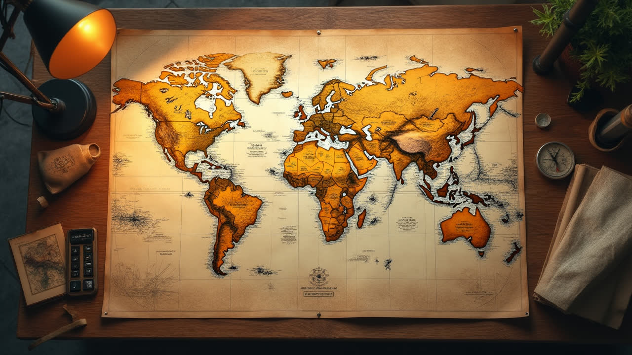
Political Maps: Boundaries and Governance
Shifting from natural features to human constructs, political maps focus on the invisible lines that shape our world: borders, boundaries, and administrative divisions. These maps typically use different colors to distinguish between different countries, states, or provinces, making it easy to visualize political territories.
Unlike physical maps, political maps generally don't show elevation or natural features (unless they're serving as important boundaries). Instead, they highlight capitals, major cities, and sometimes transportation networks that connect these population centers. These maps tell the story of how humans have organized themselves across the landscape.
During my college years studying international relations, political maps were our constant companions. I recall one heated classroom debate about disputed territories where we all clustered around a political map, pointing and arguing about historical claims and current control. It struck me then how these colorful boundaries on paper represented such deep and complex human stories of conquest, compromise, and cooperation.
Political maps are constantly evolving as borders change through agreements, conflicts, or the emergence of new nations. They serve as historical documents, capturing the geopolitical reality of a specific moment in time. For diplomats, historians, students, and travelers, these maps provide crucial context for understanding global events and relationships between nations.
Climate Maps: Understanding Weather Patterns
Ever wonder why certain regions experience specific weather patterns? Climate visualization through specialized maps helps explain these phenomena. Climate maps display temperature patterns, precipitation levels, and climate zones across different geographical areas, typically using color coding to represent different conditions.
Unlike weather maps that show current conditions, climate maps illustrate long-term patterns and averages. They might display average annual rainfall, temperature ranges throughout the year, or climate classification systems like the Köppen-Geiger system, which categorizes regions based on vegetation, temperature, and precipitation patterns.
I remember trying to plan a "perfect weather" vacation a few years back, hopping from one destination to another to follow ideal temperatures. My climate map became my travel agent! Understanding seasonal patterns helped me avoid both monsoon seasons in Southeast Asia and the scorching summer heat of Mediterranean countries. These maps don't just inform scientists—they help everyday decisions from vacation planning to home buying.
Climate maps are increasingly important as we grapple with climate change and its effects. They help scientists track shifting patterns, inform agricultural planning, and guide development decisions. For meteorologists, farmers, city planners, and even insurance companies, these maps provide vital information about environmental conditions that affect virtually every aspect of human activity.
Economic or Resource Maps: Visualizing Prosperity
Where are natural resources located, and how does economic activity vary across regions? Economic maps answer these questions by displaying information about industries, resources, trade routes, and development levels. These specialized maps use various symbols, colors, and annotations to show everything from mineral deposits and agricultural zones to manufacturing centers and trade networks.
Economic maps can focus on specific industries (like agriculture or mining) or provide a comprehensive overview of a region's economic activity. They often include supporting data like income levels, unemployment rates, or production volumes to give context to the spatial information they display.
During my brief stint in international business, these maps were invaluable tools for understanding market potential and supply chain logistics. I recall one project where we were considering expansion into Central America, and an economic resource map of Panama completely changed our strategy by highlighting infrastructure and resource advantages we hadn't previously considered.
These maps serve as powerful decision-making tools for businesses, investors, policymakers, and development organizations. They help identify opportunities, understand resource distribution, and analyze economic disparities between regions. In an increasingly interconnected global economy, economic maps provide crucial context for understanding the flow of goods, services, and capital around the world.
Thematic Maps: Focusing on Specific Phenomena
When you need to understand one specific aspect of a region in depth, thematic cartography comes to the rescue. Thematic maps focus on displaying specific data or themes related to a geographic area, allowing for in-depth analysis of particular phenomena. They can illustrate anything from population density and voting patterns to disease spread and language distribution.
What makes thematic maps particularly powerful is their ability to transform complex statistical data into visual patterns that are easy to comprehend. They use various techniques like choropleth (shaded areas), isopleth (contour lines connecting points of equal value), dot density, or proportional symbols to represent data in relation to geography.
I've become somewhat obsessed with thematic maps in recent years—they tell such fascinating stories! During the last election, I spent hours studying voter distribution maps, noticing patterns I never would have understood from raw numbers alone. These visual representations turned abstract statistics into meaningful insights about demographic and regional voting trends.
Urban planners use thematic maps to understand population growth and infrastructure needs. Public health officials use them to track disease outbreaks and allocate resources. Marketers use them to identify target demographics. Their versatility makes thematic maps some of the most innovative and widely-applied mapping tools in the modern world.
Road Maps: Finding Your Way
Perhaps the most frequently used type in our daily lives, road maps focus on transportation networks and navigation. These practical maps show highways, roads, streets, railways, and sometimes subway systems, along with points of interest like airports, hospitals, parks, and tourist attractions.
Road maps prioritize clarity and usability over geographical accuracy—they often distort distances or simplify terrain features to make routes easier to follow. The primary goal is helping travelers get from point A to point B efficiently, which requires emphasizing the information that's most relevant to navigation.
I still keep a physical road atlas in my car despite having GPS on my phone. Why? Because there's something reliable about a map that doesn't need battery power or cell service! Last summer when my phone died in a remote area of the Southwest, that old-school road map guided me safely to the next town. Sometimes the oldest solutions are still the most dependable.
Though digital navigation has revolutionized how we use road maps, the fundamental purpose remains unchanged. Whether printed on paper or displayed on a smartphone, road maps continue to serve as essential tools for travelers, logistics companies, emergency services, and anyone else who needs to navigate our complex transportation networks.
Digital and Interactive Maps: The Modern Evolution
The digital revolution has transformed cartography, giving rise to interactive mapping platforms that combine features of multiple traditional map types. Digital maps can seamlessly switch between physical, political, and road views, or overlay thematic data on demand. They can be updated in real-time with traffic conditions, weather patterns, or even social activities.
What sets digital maps apart is their interactivity. Users can zoom from a global view down to street level, search for specific locations, get directions with alternative routes, and even explore places through street-view photography. The ability to layer information—showing restaurants, gas stations, or historic sites on demand—makes these maps incredibly versatile.
I've developed a love-hate relationship with digital maps over the years. While I appreciate the convenience of having the world's cartography in my pocket, I sometimes find myself mindlessly following the blue line on my screen instead of truly observing and connecting with my surroundings. That said, the time these tools have saved me from being hopelessly lost is immeasurable!
GIS (Geographic Information System) professionals use sophisticated digital mapping tools to analyze spatial data for everything from urban planning to environmental conservation. Meanwhile, millions of people rely on consumer applications like Google Maps, Apple Maps, or Waze for daily navigation. Digital maps have democratized access to geographical information, putting powerful spatial tools in the hands of everyday users.
Comparison of Different Map Types
| Map Type | Primary Features | Main Users | Key Strengths | Limitations | Color Coding | Typical Scale | Digital Availability |
|---|---|---|---|---|---|---|---|
| Physical Maps | Mountains, rivers, lakes, oceans | Students, hikers, geographers | Clear visualization of landforms | Limited human context | Blue (water), green (low elevation), brown (high elevation) | Various (small to large) | Widely available |
| Topographical Maps | Contour lines, elevation details, terrain features | Hikers, military, engineers | Precise elevation data | Complex to read for beginners | Varies, with contour lines for elevation | Large (detailed) | Increasingly available |
| Political Maps | Borders, capitals, cities | Students, travelers, politicians | Clear boundary visualization | Lacks physical features | Different colors for different territories | Various (country to global) | Very widely available |
| Climate Maps | Temperature zones, precipitation patterns | Meteorologists, farmers, planners | Shows environmental patterns | Often shows averages, not extremes | Blues/greens (wet), yellows/reds (dry/hot) | Medium to small (regional to global) | Commonly available |
| Economic Maps | Resources, industries, trade routes | Businesses, economists, investors | Visualizes economic activity | Quickly becomes outdated | Various symbols for different resources/activities | Various (local to global) | Limited but growing |
| Thematic Maps | Specific data visualization on geography | Researchers, planners, analysts | Focused data presentation | Limited to specific themes | Varies by theme (often gradient scales) | Various (neighborhood to global) | Increasingly available |
| Road Maps | Roads, highways, points of interest | Travelers, logistics companies | Practical navigation | Limited geographical accuracy | Red/yellow (major roads), black/white (minor roads) | Large (detailed) | Extremely widely available |
| Digital Maps | Interactive features, multiple layers | General public, professionals | Versatility, real-time updates | Requires technology to access | Customizable, multiple options | Variable (zoom capability) | Defined by type |
Frequently Asked Questions About Maps
How do I choose the right type of map for my needs?
Choosing the right map depends entirely on your specific purpose. If you're planning a hiking trip, topographical maps with their detailed elevation information would be most useful. For navigation while driving, road maps are your best bet. Studying global climate patterns? Climate maps will provide the insights you need. Consider what information is most important for your task, then select a map type that emphasizes those particular features. Many modern digital mapping platforms allow you to switch between different map types or overlay various data layers, giving you the flexibility to customize your view based on changing needs.
Are paper maps still relevant in the digital age?
Absolutely! While digital maps offer convenience and interactivity, physical maps provide several advantages that make them still relevant today. They never run out of battery, work in areas without cell service, and provide a larger visual overview without needing to zoom in and out. Many outdoor enthusiasts and professional navigators still rely on paper maps as primary tools or important backups. Paper maps also offer historical value and a tactile experience that many people prefer for planning or educational purposes. The best approach is often using both digital and paper maps in complementary ways, leveraging the strengths of each format depending on the situation.
How are maps created and updated in modern times?
Modern mapmaking combines several advanced technologies. Satellite imagery provides high-resolution visual data of the Earth's surface. GPS systems help pinpoint exact locations with incredible accuracy. LiDAR (Light Detection and Ranging) uses laser pulses to create detailed 3D models of terrain. Additionally, many mapping platforms now incorporate crowdsourced data, where users can submit updates about road closures, new businesses, or changed conditions. Professional cartographers and GIS specialists then compile and verify this information using sophisticated software. For digital maps, updates can be rolled out continuously as new information becomes available, while printed maps typically undergo periodic revisions. This multi-faceted approach ensures that modern maps are more accurate and up-to-date than ever before.
Navigating Your World with the Right Maps
As we've explored the diverse landscape of map types, it becomes clear that each serves a unique and valuable purpose in helping us understand our world. From the sweeping elevation changes on physical maps to the minute details of topographical contours, from the colorful political boundaries to the data-rich thematic visualizations, maps give us the power to navigate both natural and human-created environments with confidence.
Maps have evolved dramatically throughout human history, yet their fundamental purpose remains unchanged: to help us make sense of the spaces we inhabit and travel through. As digital technology continues to transform cartography, we're gaining access to increasingly personalized, interactive, and real-time mapping tools that would have seemed magical just a generation ago.
Whether you're a professional who relies on specialized maps for your work, a student learning about the world, or simply someone trying to find the best route to a new destination, understanding the different types of maps available to you can enhance your ability to navigate and comprehend our complex world. So the next time you unfold a paper map or tap open a mapping app, take a moment to appreciate the centuries of cartographic evolution that have made that tool possible—and choose the right map type for your particular journey.